Color Coordination: Mastering the Art of Mixing and Matching Hues
Ever stood in front of your closet, unsure of what goes with what? You’re not alone. Color coordination can feel intimidating—but it’s one of the most powerful tools in personal style. When done right, mixing and matching hues can elevate your look, reflect your personality, and bring your wardrobe to life.
The good news? You don’t need to be a fashion expert or a color theorist to master this skill. With a few foundational tips and a little confidence, you can learn how to coordinate colors like a pro and create outfits that feel cohesive, intentional, and effortlessly stylish.
Let’s break it down.
Understanding the Color Wheel: Your Style Superpower
The color wheel is your best friend when it comes to creating color harmony. Here’s a quick breakdown:
- Primary Colors: Red, blue, yellow
- Secondary Colors: Orange, green, purple (made by mixing primaries)
- Tertiary Colors: Colors in between, like teal, magenta, and chartreuse
Now let’s look at common coordination techniques using the wheel:
1. Complementary Colors
These are colors opposite each other on the color wheel (like blue and orange or purple and yellow). When paired, they create bold, high-contrast looks that pop.
Style tip: Use one color as the dominant base and the other as an accent—like an orange bag with a navy outfit.
2. Analogous Colors
These are colors that sit next to each other on the wheel (like blue, blue-green, and green). They offer a more subtle, harmonious look.
Style tip: Perfect for monochrome or tonal outfits with a bit of depth—think olive, forest green, and mint together.
3. Triadic Colors
This involves using three colors evenly spaced on the wheel (such as red, yellow, and blue). It’s vibrant but balanced when done right.
Style tip: Choose one as your anchor color and use the other two as subtle accents through accessories or layering.
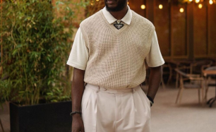
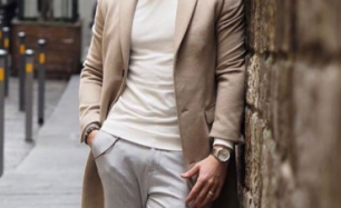
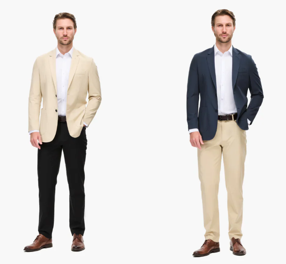
Mastering Neutrals: The Base of Every Outfit
Neutrals aren’t boring—they’re your foundation. Mastering how to pair them with colors or each other gives you endless outfit options.
- Cool Neutrals: White, black, gray, navy
- Warm Neutrals: Beige, camel, ivory, olive, taupe
Tips:
- Mix different neutrals (like black and beige or white and camel) for a timeless, minimalist palette.
- Add one bold color—like a cobalt bag or emerald blazer—to neutral outfits for an eye-catching pop.
- Layer similar-tone neutrals (think various shades of gray or off-white) for a chic tonal look.
Monochrome Doesn’t Mean Monotone
A monochrome outfit doesn’t have to mean wearing the exact same shade from head to toe. Instead, it’s about layering different tones, shades, and textures of the same color family.
Style tip: Try all-denim looks, various shades of beige, or a head-to-toe red outfit that shifts from deep burgundy to soft coral.
This approach elongates the body and creates a sleek, cohesive aesthetic.
Accent Colors: Small Touches, Big Impact
If you’re hesitant about bold color combinations, start small.
- Add a statement shoe in a contrasting color.
- Throw on a colorful bag or scarf.
- Layer a bright jacket over a muted base outfit.
These accents draw the eye and bring personality to an otherwise simple ensemble.
Color combos to try:
- Navy + mustard
- Olive + blush pink
- Charcoal gray + burnt orange
- Taupe + lavender
The Power of Prints in Color Coordination
Prints are an easy way to play with multiple colors without overthinking. Use the colors in the print as your guide for building the rest of the outfit.
Style tip: Pull one or two colors from the print and echo them in your shoes, accessories, or layers. This creates cohesion without being matchy-matchy.
Seasonal Color Swaps
You don’t have to change your entire wardrobe by season—just shift your palette slightly.
- Spring/Summer: Soft pastels, brights, crisp whites, and cool tones
- Fall/Winter: Earth tones, jewel tones, deep neutrals, and warm metallics
Style tip: A dusty rose that feels airy in summer can be grounded with chocolate brown or navy in the fall.
Trust Your Eye and Experiment
The best way to get better at color coordination is to experiment. Take photos of outfits you love, save inspiration online, and don’t be afraid to make unexpected pairings.
Fashion is creative—not a strict science. Over time, you’ll develop an instinct for what feels balanced, bold, or uniquely you.
Final Thoughts
Color coordination isn’t about following rigid rules—it’s about using color as a tool to express yourself and feel confident in what you wear. Whether you’re keeping it subtle or going vibrant, mixing hues with intention allows you to build a wardrobe that’s not only versatile but distinctly yours.
Start with a color you love, add a complementary or contrasting tone, and build from there. Your closet is your canvas—and the combinations are endless.